
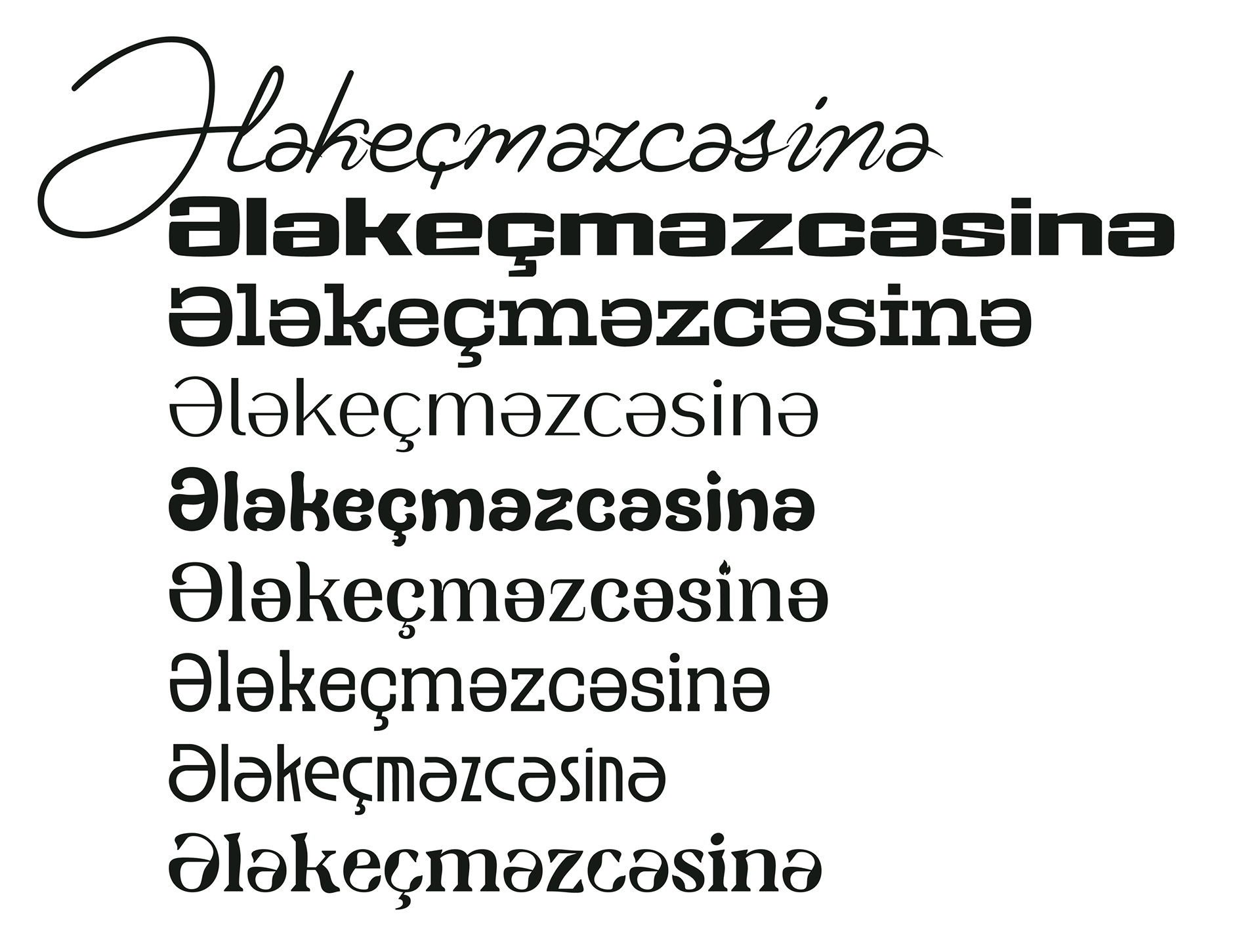
I share on my Instagram account as much as possible about how the Əə letter can be designed. One of the reasons I come to type design is the Əə letter. About 6-7 years ago, amateur form, if the fonts I used didn't have the Əə letter, I would add it, or when it wasn't properly designed, I would correct it and use it again. Later, through online type design tutorial, I developed myself. Currently, I'm learning from designers whom I consider masters, getting ideas and advice. I have more than 16 fonts. I have recently started to renew many of my fonts. Because as I develop, I see the mistakes I made and feel obligated to renew them. Let's get to the main point. Generally, Əə letters are designed in a much worse form in serif fonts. In the last 3-4 years, this letter has partially started to be properly designed. Most type designer think they design the "ə" letter by simply rotating the "e" letter 180 degrees. In doing so, they forget that they are simply adding a spot to their style. I will show you examples of this. First, I will start with old fonts.
1. Times New Roman. (Monotype Type Drawing Office - Stanley Morison, Victor Lardent 1932)
As you can see, the lowercase "ə" letter is added by flipping the "e" letter upside down
The capital letter "Ə" could have looked smoother if it had been slightly reduced in size, especially if it had been made a bit narrower than the "O" letter.
2. Times (© 1990-99 Apple Computer Inc. © 1981 Linotype AG © 1990-91 Type Solutions Inc. © 1990-91 The Font Bureau Inc.)
This is Times. Generally, not much effort has been made for the "Ə" letter here. The evolution starting from the small "e" letter has simply halted halfway.
3. Verdana (© 2006 Microsoft Corporation. )

In the Verdana font, the capital "Ə" looks better. However, unfortunately, when we look at the small "ə" letter, the "e" letter stands out to us.
4. Baskerville (Monotype Baskerville™)
However, it could have looked better
5.Bodoni 72 (Copyright © 1997 International Typeface Corporation.)
Here, the capital letter is forgotten, and the "ə" letter remains as usual.
6. Bodoni Egyptian (Copyright (c) 2010 by Nick Shinn. Published by Shinn Type Foundry.)
7. Bodoni PT Display (Copyright (c) 2021 Paratype, Inc., ParaType Ltd.)
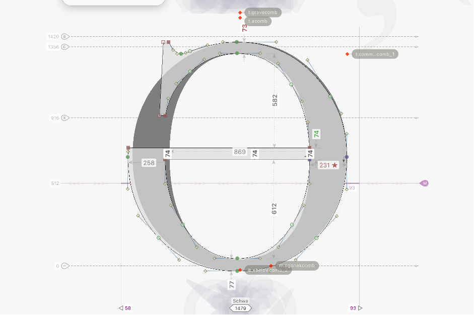
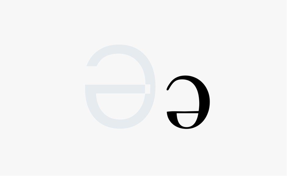
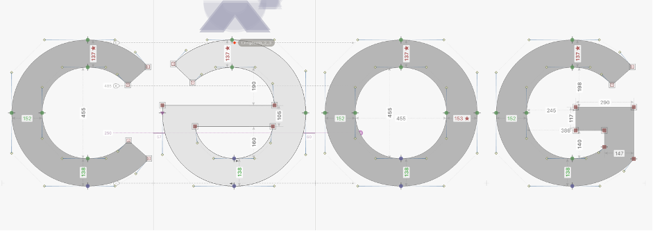
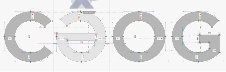
As you can see, in fonts with more serif styles, the small "ə" letter doesn't appear as appealing. In sans serif fonts, although it may not be as striking at times, upon closer inspection, we still notice irregularities in its design. So, how should proper design be? I'll explain it to the best of my ability. If you noticed, in the fonts I showed as examples, in the words I wrote contained the letters Cc, G, Ss, and a. My intention in showing words starting with these letters is that when creating the Əə letters, you should design them using the upper terminals. It should be remembered that the small "ə" letter should be devoid of narrow like from the "o" letter and wide than the "e" letter. However, you may not always adhere to this strictly or differentiate slightly. This is more applicable for thicker fonts. The capital "Ə" letter, it can be devoid of narrow like from the "O" letter or be sized similar to C, G. The most important thing is that the middle line in both letters (Əə) should be at least partially above. This is something designers often overlook. They rotate the e letter but don't raise the middle line. For the capital Ə letter, the middle line should be slightly below the "H" letter or at the level of the "H" letter. In sans serif fonts, if you create a family font, you should compensate for this more successfully. Generally, in thicker fonts, the appearance of the middle line should be more contrasting. Let me visually demonstrate what I've written. For example, let's look at the second font, "Times."
Original

After the correction,
Here, I designed the small "ə" letter in two forms. Both can be used. Remember, it's always necessary to use the upper terminal of "c", "s", and sometimes "a" letters. They should be in the following dimensions.
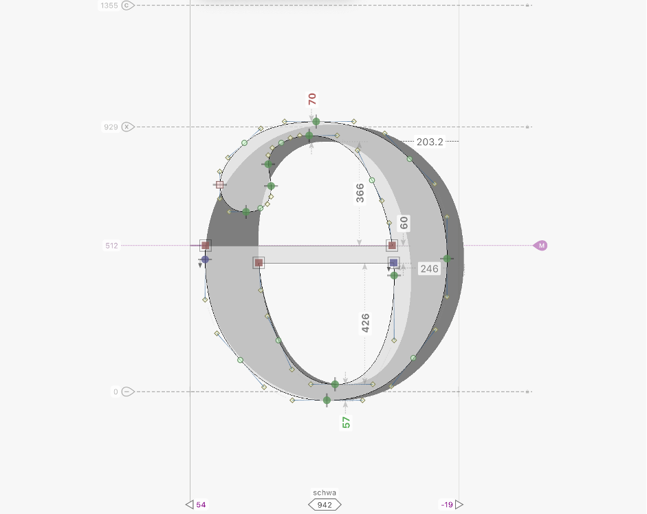
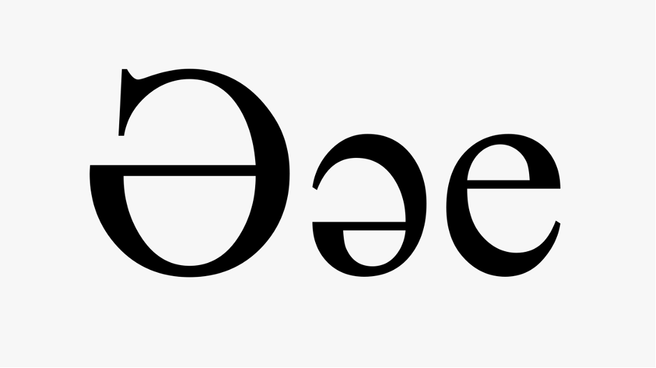
Devoid of narrow like from the "o" letter (as above), and wide than the "e" letter (as below).
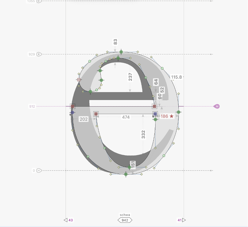
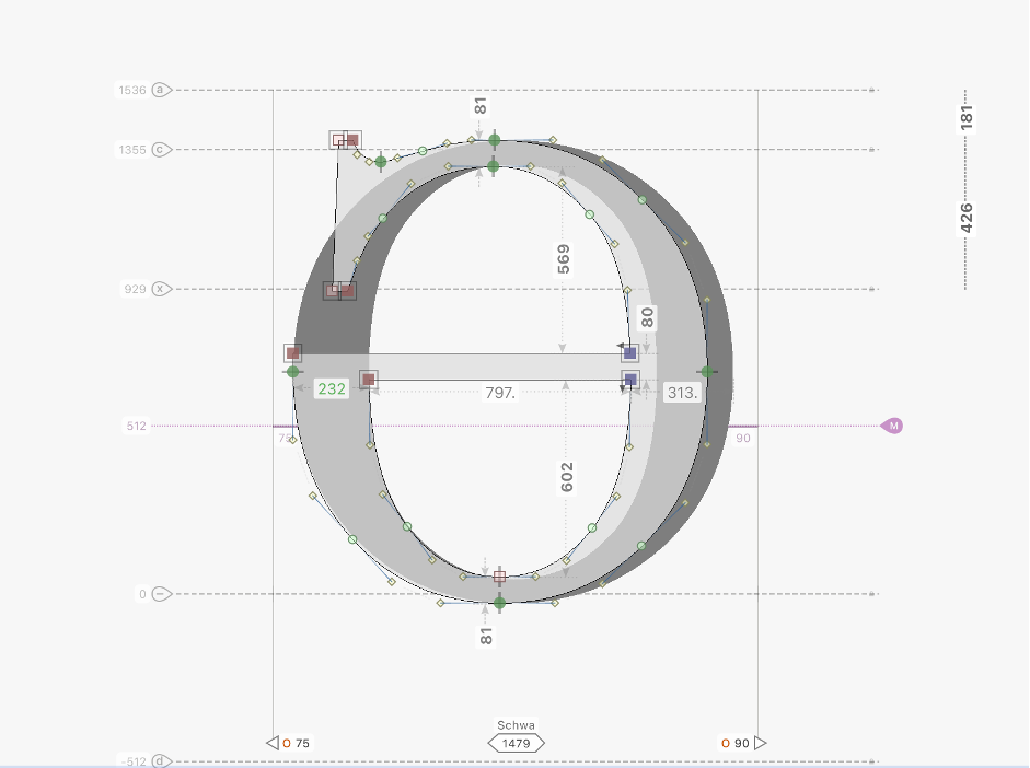
The capital "Ə" letter should Devoid of narrow from the "O" letter.
8. TT Norms Pro v3 2021 (TypeType)
In the TT Norms Black version, the "e" letter creates the "ə" letter. As I mentioned, this is not as common in sans serif fonts, especially in thicker weights where it may not attract much attention. I should also note that in thicker weights, some rules, such as the "ə" letter being wide than "e" and devoid be of narrow from the "o", are not essential. However, this rule should be followed for the capital "Ə" letter. This is keeped in TT Norms. Just it would have been good to raise the middle line slightly. By the way, in thicker weights, when raising the middle line, it's possible to narrow the terminal and lower part slightly. This creates contrast. I've shown this as an example in the image below.
TT Norms Bold Original
My suggestion.
TT Norms Black Original
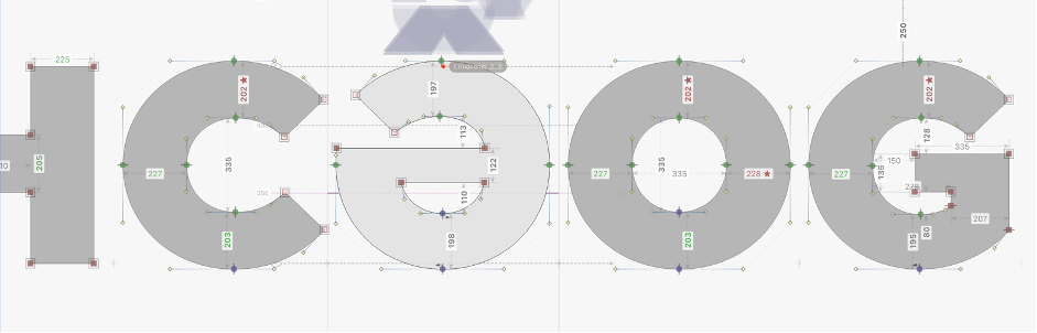
My suggestion.

By the way, TypeType frequently updates and improves its old fonts. I hope they will also pay attention to these details.
Let's look at another font.
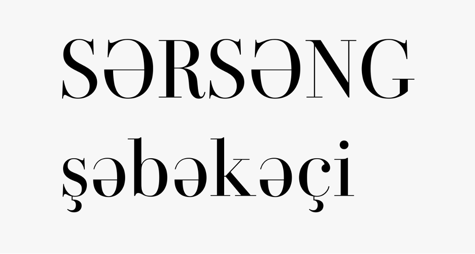
9. Boruna (Sigit Dwipa Raharjo).
See, in fonts of this style, the "Əə" letters can sometimes look good. Here, the "e" letter to chaff out to us. If you have a personal project or a project of little importance, you can use it. Conversely, if you are very sensitive about your work, I suggest you look at the following versions.
Original
My suggestion.
Second version
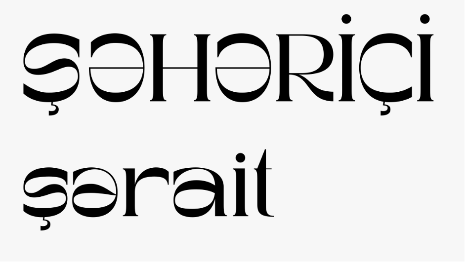
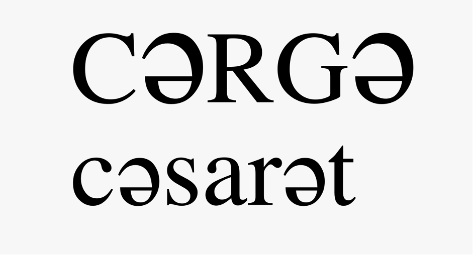
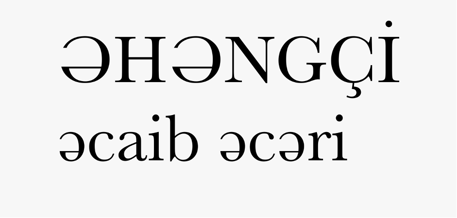
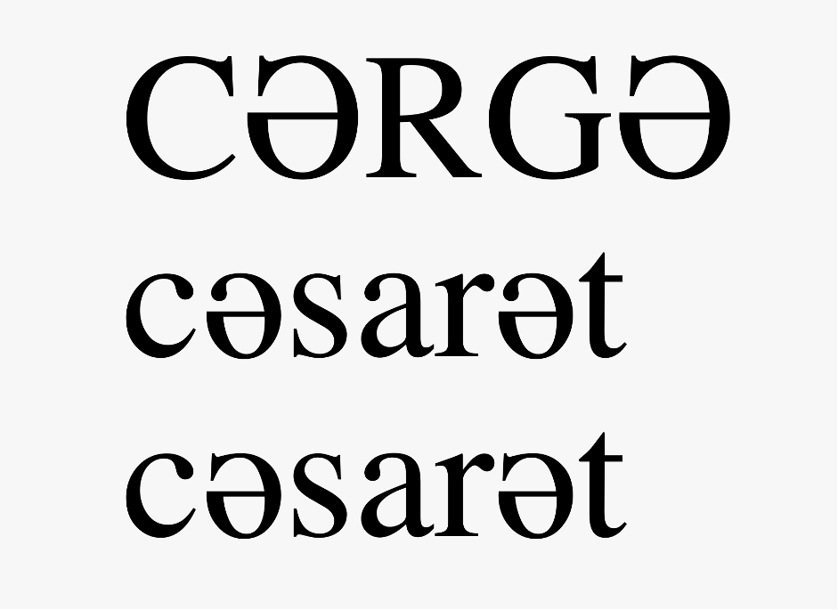
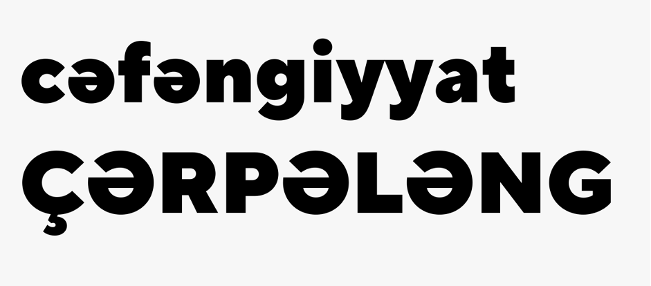
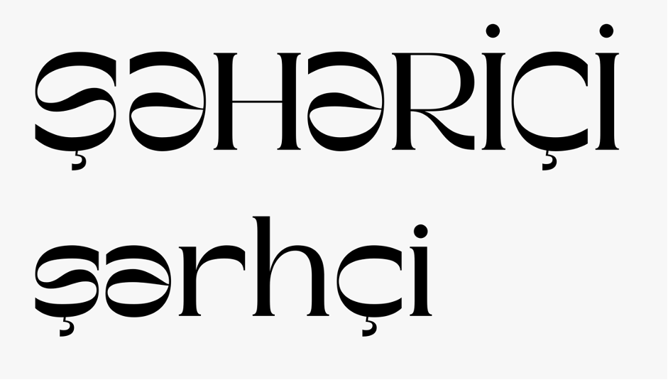
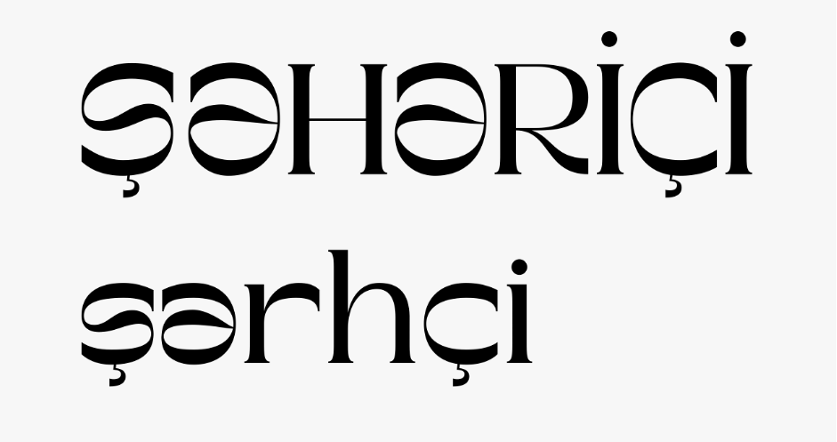
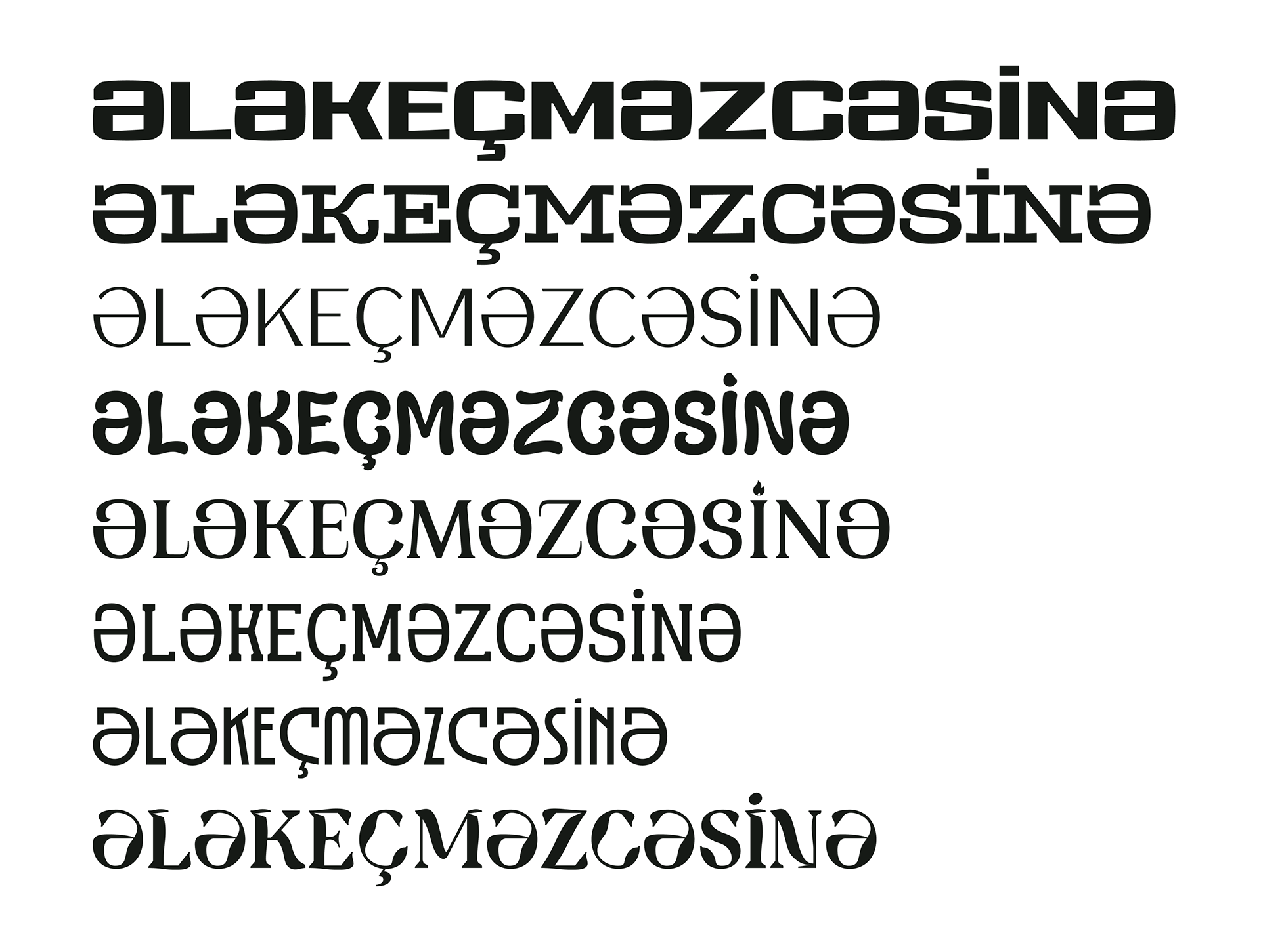
I show how the letters Əə will appear in some of the my fonts on the list.
In the second version, the design of the capital Ə letter can be used for the small letter as well. Or conversely, the small ə letter can be designed like the capital Ə.
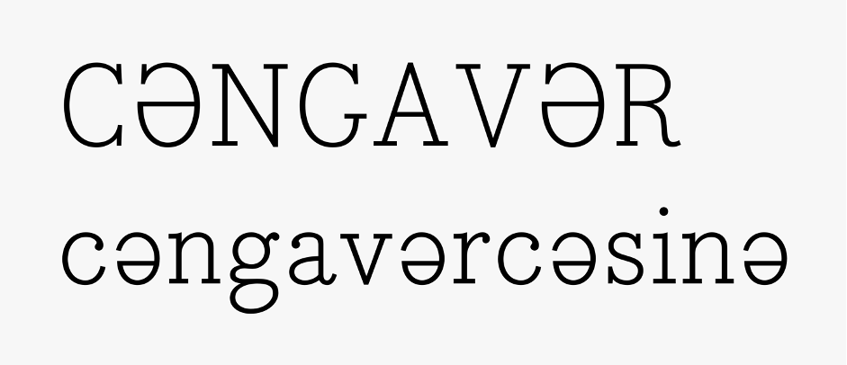
10. TA Kenisans Grotesk
Finally, I want to mention that I have provided you with information about sans serif and serif styles in this text. However, it would be good to consider some nuances that I mentioned here in other styles as well. Pay attention to the thickness of terminals and middle lines. If needed, feel free to write to me without hesitation.